Filed under: ANG Seminar 2018, Melita's Designs, Purple Mountains Majesty
Purple Mountains Majesty didn’t receive a ribbon even though it scored 91 out of 100 (design=23, color=25, workmanship/technique=17, suitability=19, finishing=7). No real negatives were pointed out in this judge’s critique. Rather positives were pointed out including that the stitches themselves were well executed with a nice even tension, I manipulated the thread well to yield the affect I was looking for, and the areas that I refer to as ‘broken color placement’ (in my artist statement below) enhanced the overall design by providing depth to your landscape. She did make an interesting comment: “There are a few spots where the dye is not solid on the thread. There is nothing you can do about that unless you get a colored marker. Such a marker can be used on a thread before or after stitching. If the thread is too thin, you can color wash the canvas to prevent it from glinting through.” I didn’t realize using a color marker on thread was an acceptable practice!
My artist’s statement follows:
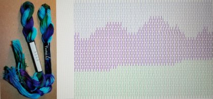
I wanted to explore using one overdyed thread with a few distinct colors to see how I could control the color of that overdyed thread in a single design that was pictorial in nature. This thread popped out at me because it had blue and green. I knew using an overdyed blue thread for sky and an overdyed green thread for grass is very effective. When I saw that the color shift was green to purple to blue, I heard “America The Beautiful” singing the lyrics “purple mountains majesties” and knew this would be great for the exhibit in Washington, DC. I thought I’d control the color best with the brick stitch. However, the various lengths of each color varied within the skein make controlling the color more difficult. There is some broken color placement which when viewed from a distance mixes optically to form the impression of reflected color. And, I obtained some aerial perspective with some of the mountains in the far distance which blurred into a bluish-purple haze.

1 Comment so far
Leave a comment

This came out great. Love your choice of colors and design.
Comment by brendasneedlepointstudioblog September 5, 2018 @ 6:20 am